# Load required libraries for data manipulation, visualization, and time series handling
library(tidyverse)   # Data wrangling and visualization framework
theme_set(theme_bw()) # Set a clean and minimal default ggplot2 theme
library(plotly)      # Interactive visualization
library(xts)         # Time series data structure and analysis
library(patchwork) # Combine multiple ggplots into one layoutExploratory data analysis (EDA)
1 Statistical Overview
Before conducting any formal analysis, it is essential to first develop a preliminary understanding of the dataset. This step involves exploring the basic structure, summarizing key characteristics, and evaluating data quality. Therefore, Exploratory Data Analysis (EDA) serves as a crucial first stage in any data analysis process.
During the initial phase of EDA, it is encouraged to freely investigate any hypothesis or question that arises (Wickham, Cetinkaya-Rundel, and Grolemund 2023).
Statistical summaries provide the most fundamental insights into a dataset and are typically the easiest to obtain. More comprehensive summaries—such as quantiles, distributions, and visual representations—are discussed in the companion sections Statistic Basics and Graphical Statistics.
2 Unusual Values (Outliers)
While summary statistics offer a general overview, a closer look is often needed to assess data quality. Unusual or extreme observations (outliers) may appear in statistical summaries but are not always immediately evident. The goal of this section is to identify, visualize, and handle such anomalies appropriately.
2.1 Dataset Description
For demonstration purposes, we will use a synthetic dataset derived from daily temperature data recorded at the Düsseldorf station of the DWD, covering the period from 2005 to 2024.
In the correlation section, we will additionally use discharge data from two stations located in the Ruhr River basin.
The following R packages are required and will be loaded below:
To visualize the dataset in its basic form, we will define a few helper functions that plot the time series and display key patterns in the data.
Code
color_RUB_blue <- "#17365c"
color_RUB_green <- "#8dae10"
color_TUD_middleblue <- "#006ab2"
color_TUD_lightblue <- "#009de0"
color_TUD_green <- "#007d3f"
color_TUD_lightgreen <- "#69af22"
color_TUD_orange <- "#ee7f00"
color_TUD_pink <- "#EC008D"
color_TUD_purple <- "#54368a"
color_TUD_redpurple <- "#93107d"
color_SafetyOrange <- "#ff5e00"

plotly_xts_single <- function(xts_Data) {
  # Check input
  if (!xts::is.xts(xts_Data))
    stop("Input must be an xts object.")
  if (NCOL(xts_Data) != 1)
    stop("xts object must contain exactly one column.")

  # Extract data frame for ggplot
  df <- data.frame(
    Date = zoo::index(xts_Data),
    Value = as.numeric(xts_Data)
  )
  colname <- colnames(xts_Data)[1]

  # Create ggplot
  p <- ggplot(df, aes(x = Date, y = Value)) +
    geom_line(color = "#17365c") +
    labs(
      xts_Data = "Date",
      y = colname
    )
  ggplotly(p)
}

plot_xts_outlier <- function(xts_Data, idx_Outlier) {
  # Input checks
  if (!xts::is.xts(xts_Data))
    stop("Input must be an xts object.")
  if (NCOL(xts_Data) != 1)
    stop("xts object must contain exactly one column.")

  # Align the two time series to the common time range

  xts_Data_Outlier <- xts_Data
  xts_Data_Outlier[] <- NA
  xts_Data_Outlier[idx_Outlier] <- xts_Data[idx_Outlier]
  xts_Data[idx_Outlier] <- NA
  # Create ggplot
  p <- ggplot() +
    geom_line(aes(index(xts_Data), y = xts_Data, color = "Normal")) +
    geom_line(aes(index(xts_Data_Outlier), y = xts_Data_Outlier, color = "Outlier")) +
    scale_color_manual("", values = c("Outlier" = "#EC008D", "Normal" = "#17365c")) +
    labs(
      xts_Data = "Date",
      y = colnames(xts_Data)
    )

  # Convert to interactive plotly
  ggplotly(p)
}
A basic overview of the dataset is presented below using an interactive line plot, which allows us to visually explore the temporal variation of daily temperature values over the observation period.
# Read the synthetic temperature dataset and convert it into an xts time series object
xts_Outlier <- read_csv("https://raw.githubusercontent.com/HydroSimul/Web/refs/heads/main/data_share/df_TS_Outlier.csv") |>
  as.xts()
# Visualize the daily temperature time series interactively
plotly_xts_single(xts_Outlier)2.2 Preliminary Global Checks for Invalid Data
2.2.1 Marked Values
In some datasets, specific “marked” values are used to indicate special meanings, often falling outside the normal measurement range. For example:
- -999 may represent missing data,
- -777 may indicate extremely high or low measurements.
These coded values must be identified and handled appropriately before analysis. If no additional information or suitable replacements are available and the dataset is sufficiently large, these marked values can be directly treated as unknown. In practice, this means replacing codes like -999 or -777 with proper missing value indicators (e.g., NA in R) so that statistical software correctly interprets them instead of treating them as valid numeric values.
Typically, marked values are documented in a metadata file, README, or on the data provider’s website.
If no documentation exists, they can often be detected through basic visual inspection, appearing as extreme outliers or long constant sequences in a time series plot.
To replace these marked values, a simple equality check (==) can locate them, and they can then be replaced with NA:
# Extract a subset of the dataset for 2005–2006
xts_Outlier_Marked <- xts_Outlier["2005-01-01/2006-12-31"]

# Identify marked values (-999) and replace them with NA
idx_Outlier_Marked <- which(xts_Outlier_Marked == -999)
xts_Outlier_Marked[idx_Outlier_Marked] <- NA
The following plot illustrates this process: the original data (with marked values) is shown in pink, while the cleaned version (after replacing marked values with NA) is shown in dark blue.
plot_xts_outlier(xts_Outlier["2005-01-01/2006-12-31"], idx_Outlier_Marked)2.2.2 Basic Rational Range
Most measured variables have a reasonable or “rational” range. For example:
- Environmental variables like precipitation or discharge should always be positive.
- Air temperature has a wide global range (e.g., −50°C to 50°C), but for a specific location, this range can be narrowed.
To filter unrealistic values, we can restrict all measurements to fall within a defined interval. For the Düsseldorf station, a reasonable daily temperature range is -15 °C to 50 °C. Values outside this range can be identified using logical operators (>, <) and replaced with NA to indicate invalid data:
# Extract a subset for the year 2012
xts_Outlier_Range <- xts_Outlier["2012-01-01/2012-12-31"]

# Identify values outside the rational range and set them to NA
idx_outlier_Range <- which(xts_Outlier_Range > 38 | xts_Outlier_Range < -15)
xts_Outlier_Range[idx_outlier_Range] <- NA
The cleaned results after applying this rational range filter are shown below:
plot_xts_outlier(xts_Outlier["2012-01-01/2012-12-31"], idx_outlier_Range)2.3 Outlier Identification with Statistical Methods
In addition to global range checks, general statistical methods can help identify unusual values more objectively.
These approaches are particularly useful for obtaining a first overview of the dataset, especially when we lack deep prior knowledge.
2.3.1 Z-Score Method
The Z-score method measures how far each data point is from the mean, in units of standard deviation.
Values with very high or very low Z-scores are far from the center of the distribution and may be considered outliers.
A common rule of thumb is that points with an absolute Z-score greater than 3 are potential outliers.
Note that this threshold assumes approximately normal data — for non-normal distributions, the Z-score may be less reliable.
2.3.1.1 Checking the Normality of Temperature at the Station
# Extract temperature data from 2013–2024
num_Hist <- xts_Outlier["2013-01-01/2024-12-31"] |> as.numeric()

# Plot histogram
ggplot() +
  geom_histogram(aes(num_Hist), color = color_RUB_blue, fill = color_RUB_green) +
  labs(x = "Temperature (°C)", y = "Frequency", title = "Histogram of Daily Temperature")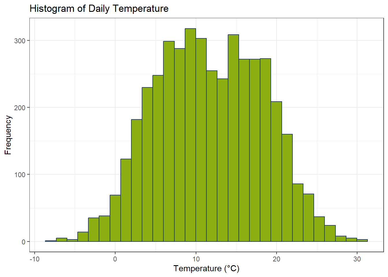
The Shapiro-Wilk test evaluates whether a variable follows a normal distribution. It produces two key outputs:
- W (Shapiro-Wilk statistic): measures how closely the sample data resemble a normal distribution. Values near 1 indicate approximate normality.
- p-value: indicates the statistical significance of the deviation from normality. A small p-value (typically < 0.05) suggests significant deviation from normality.
Note: The W statistic reflects the degree of normality, while the p-value also considers sample size. Large datasets can produce very small p-values even when W is close to 1.
# Perform Shapiro-Wilk test for normality
shapiro.test(num_Hist)
    Shapiro-Wilk normality test

data:  num_Hist
W = 0.9919, p-value = 4.143e-15
Although the p-value may be smaller than 0.05, combining it with the histogram and W-value shows that the data are sufficiently symmetric for Z-score based outlier detection to remain useful.
2.3.1.2 Outlier ckeck with Z-Score
# Subset the data for 2012
xts_Outlier_Statistic_Z <- xts_Outlier["2012-01-01/2012-12-31"]

# Compute Z-scores and identify outliers
num_ZScores <- scale(xts_Outlier_Statistic_Z)
threshold_Z <- 3
idx_Outlier_Z <- abs(num_ZScores) > threshold_Z

# Replace detected outliers with NA
xts_Outlier_Statistic_Z[idx_Outlier_Z] <- NA
# Plot time series after Z-score outlier removal
plot_xts_outlier(
xts_Outlier["2012-01-01/2012-12-31"],
idx_Outlier_Z
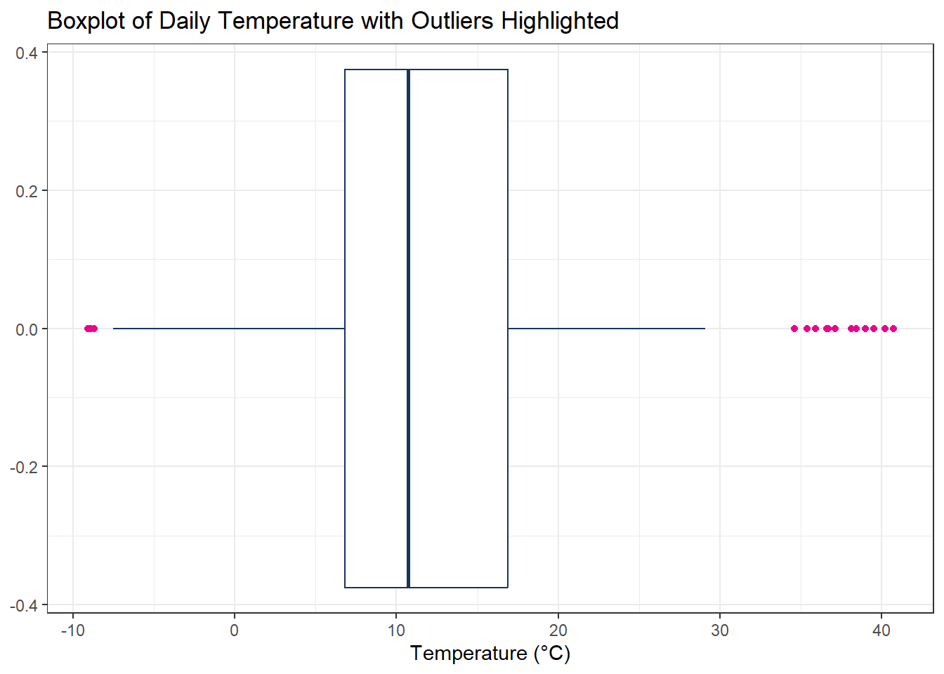
)2.3.2 Interquartile Range (IQR) Method
The Interquartile Range (IQR) method is another widely used approach for outlier detection. It focuses on the spread of the middle 50% of the data (between the first quartile Q1 and third quartile Q3). The IQR is calculated as:
The IQR is calculated as:
\[ \text{IQR} = Q3 - Q1 \]
Outliers are typically defined as values lying below or above:
\[ \text{Lower Bound} = Q1 - 1.5 \times \text{IQR} \quad , \quad \text{Upper Bound} = Q3 + 1.5 \times \text{IQR} \]
Values outside this range are considered potential outliers and can be handled appropriately.
# Subset the data for the year 2012
xts_Outlier_Statistic_IQR <- xts_Outlier["2012-01-01/2012-12-31"]

# Calculate the first (Q1) and third (Q3) quartiles
num_Q1 <- quantile(xts_Outlier_Statistic_IQR, 0.25, na.rm = TRUE)
num_Q3 <- quantile(xts_Outlier_Statistic_IQR, 0.75, na.rm = TRUE)

# Compute the Interquartile Range (IQR)
num_IQR <- num_Q3 - num_Q1

# Define lower and upper bounds for outlier detection
bound_Lower <- num_Q1 - 1.5 * num_IQR
bound_Upper <- num_Q3 + 1.5 * num_IQR

# Identify outliers outside the IQR bounds
idx_Outlier_IQR <- (xts_Outlier_Statistic_IQR < bound_Lower) | (xts_Outlier_Statistic_IQR > bound_Upper)

# Replace identified outliers with NA
xts_Outlier_Statistic_IQR[idx_Outlier_IQR] <- NA
# Plot the time series after removing IQR-based outliers
plot_xts_outlier(
xts_Outlier["2012-01-01/2012-12-31"],
idx_Outlier_IQR
)Code
# Visualize outliers in a boxplot
ggplot() +
  geom_boxplot(
    aes(x = xts_Outlier["2012-01-01/2012-12-31"] |> as.numeric()),  # Convert time series to numeric vector for plotting
    color = "#17365c",                     # Box color
    outlier.color = "#EC008D"              # Highlight outliers in pink
  ) +
  labs(
    x = "Temperature (°C)",
    y = NULL,
    title = "Boxplot of Daily Temperature with Outliers Highlighted"
  )
2.4 Outlier Identification with Additional Knowledge
In many cases, outliers are more complex and cannot be detected using simple statistical rules alone.
To identify these unusual values effectively, we need to combine domain knowledge, experience, and a deeper understanding of the data.
2.4.1 Constant Sequences over Long Periods in Time Series
Some unusual situations in time series data appear as constant values over long periods.
These may indicate sensor malfunctions, data transmission errors, or missing updates.
Detecting such patterns is an important part of exploratory data analysis (EDA).
# Subset data for 2010
xts_Outlier_TS_Const <- xts_Outlier["2010-01-01/2010-12-31"]

# Identify sequences of repeated values
int_Equal <- rle(as.numeric(xts_Outlier_TS_Const))
n_Threshold <- 7  # Threshold for long constant sequences
idx_Long <- which(int_Equal$lengths >= n_Threshold)

# Convert run-length indices to actual positions
idx_Outlier_Const <- unlist(
  lapply(idx_Long, \(i) {
    start_pos <- sum(int_Equal$lengths[seq_len(i - 1)]) + 1
    end_pos <- sum(int_Equal$lengths[seq_len(i)])
    start_pos:end_pos
  })
)

# Replace long constant sequences with NA
xts_Outlier_TS_Const[idx_Outlier_Const] <- NA
# Plot time series highlighting constant sequence outliers
plot_xts_outlier(xts_Outlier["2010-01-01/2010-12-31"], idx_Outlier_Const)2.4.2 Out of Trend or Seasonality
Time series data typically consist of trend, seasonality, and residual components. By examining the trend and seasonal patterns, we can detect outliers that appear within global ranges but deviate strongly from expected patterns.
In order to detedc the distance between raw values and tresnd, the remeinder vlaues (Raw - Trend) could be used to located the outlier.
# Subset 2008 data and compute residuals after removing trend
xts_Outlier_TS_Trend <- xts_Outlier["2008-01-01/2008-12-31"]
xts_Trend <- read_csv("https://raw.githubusercontent.com/HydroSimul/Web/refs/heads/main/data_share/df_TS_TrendSeason.csv") |> as.xts()
# Remaeinder
xts_Remainder <- xts_Outlier_TS_Trend - xts_Trend
For the continued anayls we will with IQR-Apporch:
num_Q1 <- quantile(xts_Remainder, 0.25, na.rm = TRUE)
num_Q3 <- quantile(xts_Remainder, 0.75, na.rm = TRUE)

# Compute the Interquartile Range (IQR)
num_IQR <- num_Q3 - num_Q1

# Define lower and upper bounds for outlier detection
bound_Lower <- num_Q1 - 1.5 * num_IQR
bound_Upper <- num_Q3 + 1.5 * num_IQR

# Identify outliers outside the IQR bounds
idx_Outlier_Trend <- (xts_Remainder < bound_Lower) | (xts_Remainder > bound_Upper)

# Replace identified outliers with NA
xts_Outlier_TS_Trend[idx_Outlier_Trend] <- NA
Code
# Plot raw data and seasonal trend
xts_Outlier_Trend <- (xts_Outlier["2008-01-01/2008-12-31"])[idx_Outlier_Trend]
  # Create ggplot
  gp_Trend <- ggplot() +
    geom_line(aes(index(xts_Outlier_TS_Trend), y = xts_Outlier_TS_Trend, color = "Normal")) +
    geom_line(aes(index(xts_Outlier_Trend), y = xts_Outlier_Trend, color = "Outlier")) +
    geom_line(aes(index(xts_Trend), y = xts_Trend, color = "Seasonality")) +
    scale_color_manual("", values = c("Outlier" = "#EC008D", "Normal" = "#17365c", "Seasonality" = "#8dae10")) +
    labs(
      xts_Data = "Date",
      y = "Temperature (°C)"
    )

  # Convert to interactive plotly
  ggplotly(gp_Trend)
Code
# Prepare data for combined boxplot
df_Box_Trend <- data.frame(
  Value = c(as.numeric(xts_Outlier_TS_Trend), as.numeric(xts_Remainder)),
  Component = rep(c("Original", "Remainder (Seasonality Removed)"),
                  each = NROW(xts_Outlier_TS_Trend))
)

# Boxplot of original and residual data
ggplot(df_Box_Trend, aes(y = Value)) +
  geom_boxplot(color = "#17365c", outlier.colour = "#EC008D") +
  facet_wrap(~ Component, ncol = 2, scales = "free_y") +
  labs(y = "Temperature (°C)", x = NULL) +
  theme_bw() +
  theme(
    axis.x.title = element_blank(),
    axis.x.text = element_blank(),
    axis.x.ticks = element_blank(),
    panel.grid.major.x = element_blank(),
    panel.grid.minor.x = element_blank(),
    strip.background = element_rect(fill = "gray90", color = NA),
    strip.text = element_text(face = "bold"),
    plot.title = element_blank()
  )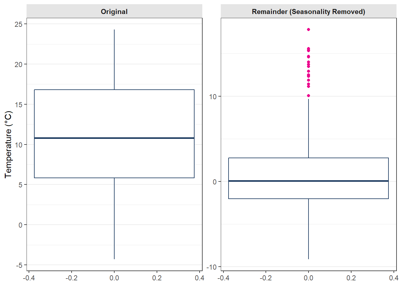
As the two plots at above showed, in the raw tiem serise, the values between 01.11.2008 and 20.11.2008 will not be rechgnized as outlier, but wenn wen check with the seasonality information, the outlier situaion is scatuall verry obvirous.
2.4.3 Relation with Additional Variables
Outliers can also be identified by examining relationships between variables. A data point far from the expected relationship between two or more correlated variables may indicate unusual behavior.
For the Ruhr Basin, two stations—upstream (Bachum) and downstream (Villigst)—usually exhibit a strong correlation (~0.99). However, Bachum occasionally reports unusually high values. Comparing with Villigst allows detection of these outliers.
# Load discharge data for both stations
xts_Bachum <- read_csv("https://raw.githubusercontent.com/HydroSimul/Web/refs/heads/main/data_share/df_TS_Bachum.csv") |> as.xts()
xts_Villigst <- read_csv("https://raw.githubusercontent.com/HydroSimul/Web/refs/heads/main/data_share/df_TS_Villigst.csv") |> as.xts()
Code
# Prepare time series and scatter plot data
df_Bachum <- data.frame(Date = index(xts_Bachum), Value = as.numeric(xts_Bachum[,1]), Station = "Bachum")
df_Villigst <- data.frame(Date = index(xts_Villigst), Value = as.numeric(xts_Villigst[,1]), Station = "Villigst")
df_Relation <- bind_rows(df_Bachum, df_Villigst)

# Time series plot
gp_TSline_Rrelation <- ggplot(df_Relation, aes(x = Date, y = Value, color = Station)) +
  geom_line(linewidth = 0.5) +
  facet_wrap(~Station, ncol = 1, scales = "free_y") +
  scale_color_manual(values = c("Bachum" = "#1f77b4", "Villigst" = "#17365c")) +
  labs(x = NULL, y = "Discharge (m³/s)") +
  theme_bw() +
  theme(legend.position = "none")

# Scatter plot of Bachum vs Villigst
df_Scatter <- data.frame(Bachum = as.numeric(xts_Bachum), Villigst = as.numeric(xts_Villigst))
gp_Scatter_Relation <- ggplot(df_Scatter, aes(x = Villigst, y = Bachum)) +
  geom_point(alpha = 0.4, color = "#8dae10") +
  geom_abline(intercept = 4.1699263, slope = 0.7132356, color = "#EC008D") +
  labs(x = "Villigst", y = "Bachum")

# Combine both plots using patchwork
(gp_TSline_Rrelation | gp_Scatter_Relation) +
  plot_layout(widths = c(3,2))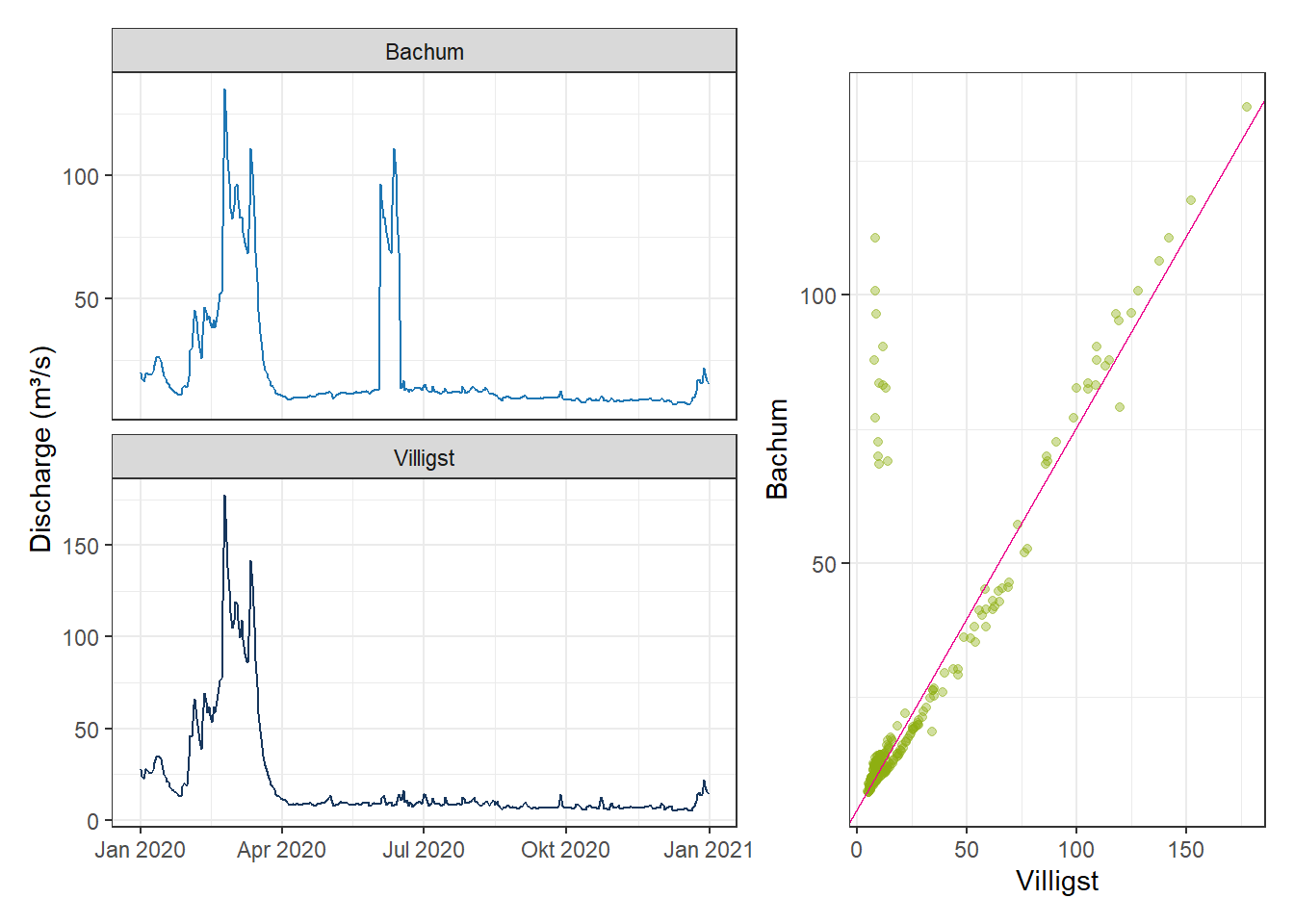
3 Handling Missing Values
In the previous section, we discussed how outliers or marked values can be converted into missing values. In many datasets, missing values already exist in the raw data. However, these missing values may still be important for further analysis. Therefore, we often need to fill or estimate them with plausible values.
As an exercise, the temperature data from the Düsseldorf station for the year 2008 will be used. The basic line plot is shown below:
xts_Missing_T <- read_csv("https://raw.githubusercontent.com/HydroSimul/Web/refs/heads/main/data_share/df_TS_Missing_T.csv") |> as.xts()plotly_xts_single(xts_Missing_T)3.1 Filling Gaps with Constant Values
The simplest method is to fill missing values with a global statistic such as the mean or median. This approach preserves the overall statistical properties of the dataset and is easy to apply.
However, the disadvantage is also clear: such replacements do not reflect local variations, trends, or relationships with other variables.
# Calculate mean and median of non-missing values
num_Mean <- mean(xts_Missing_T, na.rm = TRUE)
num_Median <- median(xts_Missing_T, na.rm = TRUE)

# Create copies for mean and median imputation
xts_Missing_T_Mean <- xts_Missing_T
xts_Missing_T_Median <- xts_Missing_T

# Identify positions of missing values
idx_Missing <- is.na(xts_Missing_T)

# Replace missing values with mean or median
xts_Missing_T_Mean[idx_Missing] <- num_Mean
xts_Missing_T_Median[idx_Missing] <- num_Median
Code
# Extract filled values for plotting
xts_Filling_Mean <- xts_Missing_T_Mean[idx_Missing]
xts_Filling_Median <- xts_Missing_T_Median[idx_Missing]

# Plot original series and imputed values
gp_Fill1 <- ggplot() +
  geom_line(aes(x = index(xts_Missing_T), y = xts_Missing_T), color = color_RUB_blue) +
  geom_line(aes(x = index(xts_Filling_Mean), y = xts_Filling_Mean, color = "Mean")) +
  geom_line(aes(x = index(xts_Filling_Median), y = xts_Filling_Median, color = "Median")) +
  scale_color_manual("", values = c("Mean" = color_TUD_pink, "Median" = color_RUB_green)) +
  labs(x = "Date", y = "Temperature (°C)")

# Convert ggplot to an interactive plotly object
ggplotly(gp_Fill1)
3.2 Simple Interpolation in the Time Dimension
For most state variables, which are strongly influenced by their previous states (e.g., temperature, river discharge, or other continuous processes), we can fill gaps by interpolating between neighboring values under the assumption of temporal continuity.
Common interpolation approaches include: - Using the previous (forward) value
- Using the next (backward) value
- Using the mean of the forward and backward values
- Linear interpolation between adjacent observations
Among these, linear interpolation is the most commonly used method in practice.
# Identify positions of missing values
idx_Missing <- which(is.na(xts_Missing_T))

# Determine indices of values before and after the missing block
idx_Forward <- idx_Missing[1] - 1           # Index just before the first missing value
idx_Backward <- idx_Missing[length(idx_Missing)] + 1  # Index just after the last missing value

# Extract the corresponding temperature values
num_Forward <- xts_Missing_T[idx_Forward]   # Value before missing section
num_Backward <- xts_Missing_T[idx_Backward] # Value after missing section

# Compute mean of forward and backward values
num_MeanForBack <- mean(c(num_Forward, num_Backward))

# Create copies for each filling approach
xts_Missing_T_MeanForBack <- xts_Missing_T
xts_Missing_T_Forward <- xts_Missing_T
xts_Missing_T_Backward <- xts_Missing_T

# Fill missing values using different methods
xts_Missing_T_Forward[idx_Missing] <- num_Forward          # Fill with overall mean
xts_Missing_T_Backward[idx_Missing] <- num_Backward      # Fill with overall median
xts_Missing_T_MeanForBack[idx_Missing] <- num_MeanForBack  # Fill with mean of adjacent values
# Create copies for linear interpolation approach
xts_Missing_T_Linear <- xts_Missing_T
# Fill missing values by linear interpolation
xts_Missing_T_Linear <- na.approx(xts_Missing_T)Code
# Extract filled values for plotting
xts_Filling_Forward <- xts_Missing_T_Forward[idx_Missing]
xts_Filling_Backward <- xts_Missing_T_Backward[idx_Missing]
xts_Filling_MeanForBack <- xts_Missing_T_MeanForBack[idx_Missing]
xts_Filling_Linear <- xts_Missing_T_Linear[idx_Missing]

# Plot original series and filled values
gp_Fill2 <- ggplot() +
  geom_line(aes(x = index(xts_Missing_T), y = xts_Missing_T),
            color = color_RUB_blue) +
  geom_line(aes(x = index(xts_Filling_Forward), y = xts_Filling_Forward, color = "Forward")) +
  geom_line(aes(x = index(xts_Filling_Backward), y = xts_Filling_Backward, color = "Backward")) +
  geom_line(aes(x = index(xts_Filling_MeanForBack), y = xts_Filling_MeanForBack, color = "Forward–Backward Mean")) +
  geom_line(aes(x = index(xts_Filling_Linear), y = xts_Filling_Linear, color = "Linear interpolation")) +
  scale_color_manual(
    "",
    values = c(
      "Forward" = color_TUD_pink,
      "Backward" = color_RUB_green,
      "Forward–Backward Mean" = color_SafetyOrange,
      "Linear interpolation" = color_TUD_lightblue
    )
  ) +
  labs(x = "Date", y = "Temperature (°C)")

# Convert ggplot to interactive plotly
ggplotly(gp_Fill2)
3.3 Model-Based Methods
By analyzing the time series components—such as trend and seasonality—or by exploring relationships with additional variables, we can construct simple models to estimate missing values. In such cases, the available data serve as model inputs, while the identified trend or relationship acts as a predictive model to fill the unknown values.
3.3.1 Filling with Trend and Seasonality
If the time series has a clear trend and seasonal pattern, missing values can be estimated using the fitted trend and seasonality components. This ensures that the filled data remain consistent with the temporal structure of the dataset.
# Load pre-calculated trend and seasonality components
xts_TrendSeason <- read_csv("https://raw.githubusercontent.com/HydroSimul/Web/refs/heads/main/data_share/df_TS_TrendSeason.csv") |> as.xts()
# Create copies for linear interpolation approach
xts_Missing_T_TrendSeason <- xts_Missing_T
# Fill missing values using the corresponding trend component
xts_Missing_T_TrendSeason[idx_Missing] <- xts_TrendSeason[idx_Missing]
Code
# Extract filled values for plotting
xts_Filling_TrendSeason <- xts_Missing_T_TrendSeason[idx_Missing]
xts_Filling_Linear <- xts_Missing_T_Linear[idx_Missing]

# Plot original series and filled values
gp_Fill3 <- ggplot() +
  geom_line(aes(x = index(xts_Missing_T), y = xts_Missing_T),
            color = color_RUB_blue) +
  geom_line(aes(x = index(xts_Filling_TrendSeason), y = xts_Filling_TrendSeason, color = "Trend + Seasonality")) +
  geom_line(aes(x = index(xts_Filling_Linear), y = xts_Filling_Linear, color = "Linear interpolation")) +
  scale_color_manual(
    "",
    values = c(
      "Trend + Seasonality" = color_RUB_green,
      "Linear interpolation" = color_TUD_lightblue
    )
  ) +
  labs(x = "Date", y = "Temperature (°C)")

# Convert ggplot to interactive plotly
ggplotly(gp_Fill3)
3.3.2 Filling with Linear Relationships
When there is a strong linear relationship between variables, we can use regression or correlation-based models to predict missing values. For example, missing discharge values might be estimated based on precipitation or temperature using a simple linear model.
# Load time series data
xts_Bachum_Missing <- read_csv("https://raw.githubusercontent.com/HydroSimul/Web/refs/heads/main/data_share/df_TS_Bachum_Missing.csv") |> as.xts()
xts_Villigst <- read_csv("https://raw.githubusercontent.com/HydroSimul/Web/refs/heads/main/data_share/df_TS_Villigst.csv") |> as.xts()

# Identify indices of missing values in Bachum series
idx_Missing_Q <- which(is.na(xts_Bachum_Missing))

# Compute correlation between Bachum and Villigst, ignoring missing values
cor(xts_Bachum_Missing, xts_Villigst, use = "complete.obs") # 0.9847129
X2
V1 0.9847129# Fit linear regression to predict Bachum from Villigst
lm_Bachum_Villigst <- lm(xts_Bachum_Missing ~ xts_Villigst)
lm_Coeffi <- lm_Bachum_Villigst$coefficients # Intercept = b, Slope = a
# Fill missing Bachum values using regression based on Villigst
xts_Bachum_Missing_Corelation <- xts_Bachum_Missing
xts_Bachum_Missing_Corelation[idx_Missing_Q] <-
lm_Coeffi[1] + lm_Coeffi[2] * xts_Villigst[idx_Missing_Q] # y = a*x + b
# Fill missing Bachum values using linear interpolation
xts_Bachum_Missing_LinearInterpolate <- na.approx(xts_Bachum_Missing)Code
# Extract filled values for plotting
xts_Filling_Corelation <- xts_Bachum_Missing_Corelation[idx_Missing_Q]
xts_Filling_Linear <- xts_Bachum_Missing_LinearInterpolate[idx_Missing_Q]
# Plot original series and imputed series
gp_Bachum_Fill <- ggplot() +
  geom_line(aes(x = index(xts_Bachum_Missing), y = xts_Bachum_Missing),
            color = color_RUB_blue) +
  geom_line(aes(x = index(xts_Filling_Corelation), y = xts_Filling_Corelation,
                color = "Regression (Villigst)")) +
  geom_line(aes(x = index(xts_Filling_Linear), y = xts_Filling_Linear,
                color = "Linear Interpolation")) +
  scale_color_manual(
    "",
    values = c(
      "Regression (Villigst)" = color_RUB_green,
      "Linear Interpolation" = color_TUD_lightblue
    )
  ) +
  labs(x = "Date", y = "Discharge (m³/s)")

# Convert ggplot to interactive plotly object
ggplotly(gp_Bachum_Fill)
References
Wickham, Hadley, Mine Cetinkaya-Rundel, and Garrett Grolemund. 2023. R for Data Science: Import, Tidy, Transform, Visualize, and Model Data. Beijing ; Sebastopol, CA: O’Reilly Media.