# Library
library(tidyverse)
theme_set(theme_bw())
library(ggh4x) # difference area
library(reshape2)

# File name
fn_ResultsHBV <- "https://raw.githubusercontent.com/HydroSimul/Web/main/data_share/tbl_HBV_Results.txt"
# Load Data
df_ResultHBV <- read_table(fn_ResultsHBV)

# Convert Date column to a Date type
df_ResultHBV$Date <- as_date(df_ResultHBV$Date |> as.character(), format = "%Y%m%d")

idx_1979 <- which(df_ResultHBV$Date >= as_date("1979-01-01") & df_ResultHBV$Date <= as_date("1979-12-31"))
df_Plot <- df_ResultHBV[idx_1979, ]Visualization
1 Library and Data
Visualizing time series is crucial for identifying patterns, trends, and anomalies in data over time. Here are some key considerations and methods for visualizing time series data.
In this Artikel we will use the R package ggplot (tidyverse) for plotig and the results data fro HBV Light as the data:
2 Line Charts
A fundamental tool for representing time series data. The x-axis represents time, while the y-axis shows the measured values, providing a clear view of changes over time.
2.1 Basic Line
ggplot(df_Plot, aes(x = Date)) +
  geom_line(aes(y = Qobs, color = "Obs.")) +
geom_line(aes(y = Qsim, color = "Sim.")) 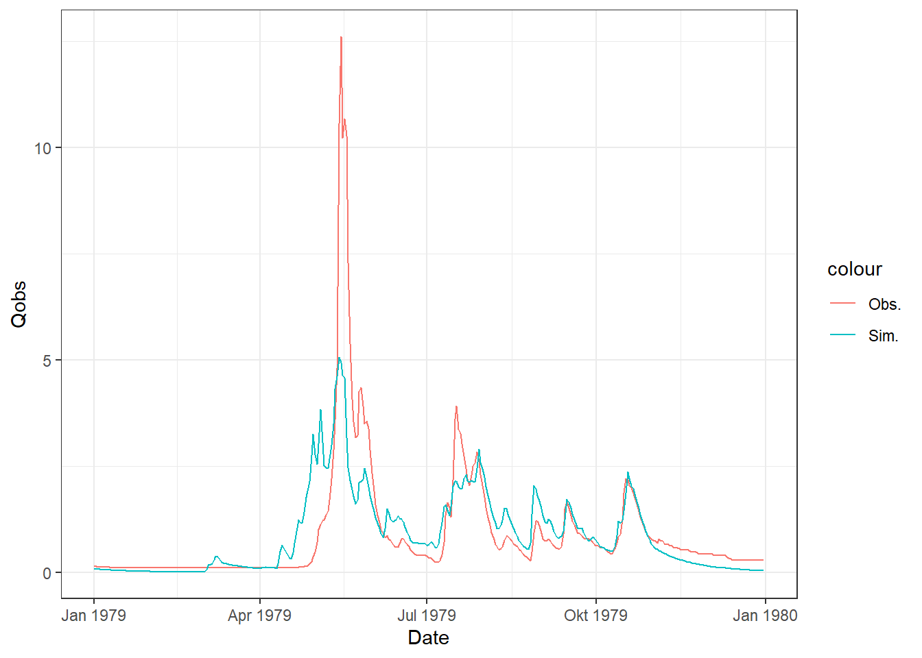
2.2 Line Plot with Shaded Difference Area
ggplot(df_Plot, aes(x = Date)) +
  geom_line(aes(y = Qobs, color = "Obs.")) +
  geom_line(aes(y = Qsim, color = "Sim.")) +
stat_difference(aes(ymin = Qsim, ymax = Qobs), alpha = .5) 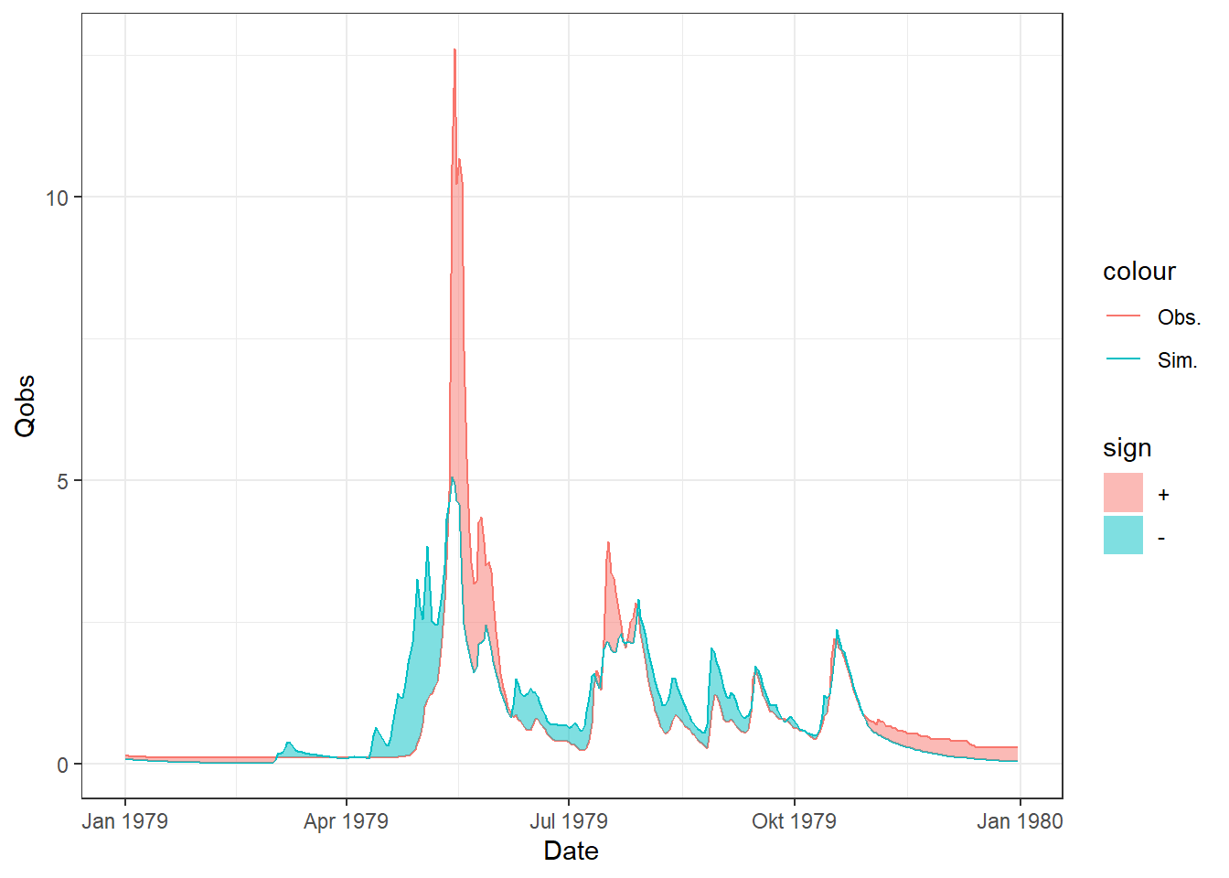
2.3 Line Cluster
# Melting the data for ggplot
df_Plot_Melt <- reshape2::melt(df_Plot[,c("Date", "Qsim", "Precipitation", "AET")], id = "Date")
# Plot
ggplot(df_Plot_Melt, aes(x = Date, y = value, color = variable, group = variable)) +
  geom_line()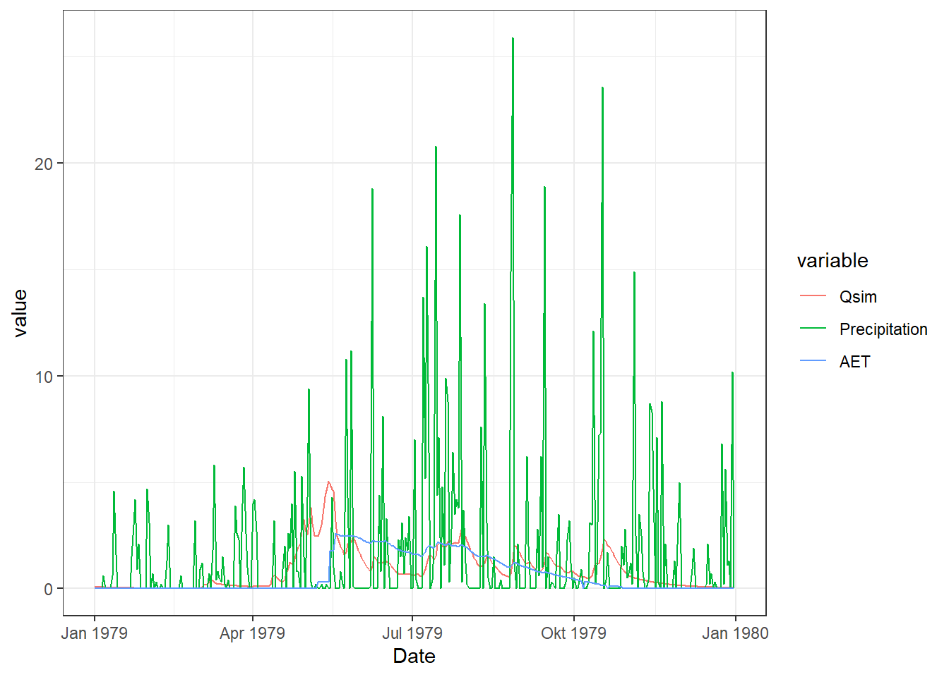
3 Barplot
A bar plot is a graphical representation of data in which bars are used to represent the values of variables.
3.1 Basic Bar
ggplot(df_Plot, aes(x = Date)) +
  geom_col(aes(y = Precipitation))
3.2 Stacked Bar
# Snowfall and rain fall caculate
df_Plot <- df_Plot |> mutate(Snowfall = pmax(0, c(0, diff(Snow))),
                             Rainfall = Precipitation - Snowfall)
df_Plot_Melt2 <- reshape2::melt(df_Plot[1:120, c("Date", "Snowfall", "Rainfall")], id = "Date")
# Plot
ggplot(df_Plot_Melt2, aes(x = Date, y = value, fill = variable, group = variable)) +
  geom_col(position="stack")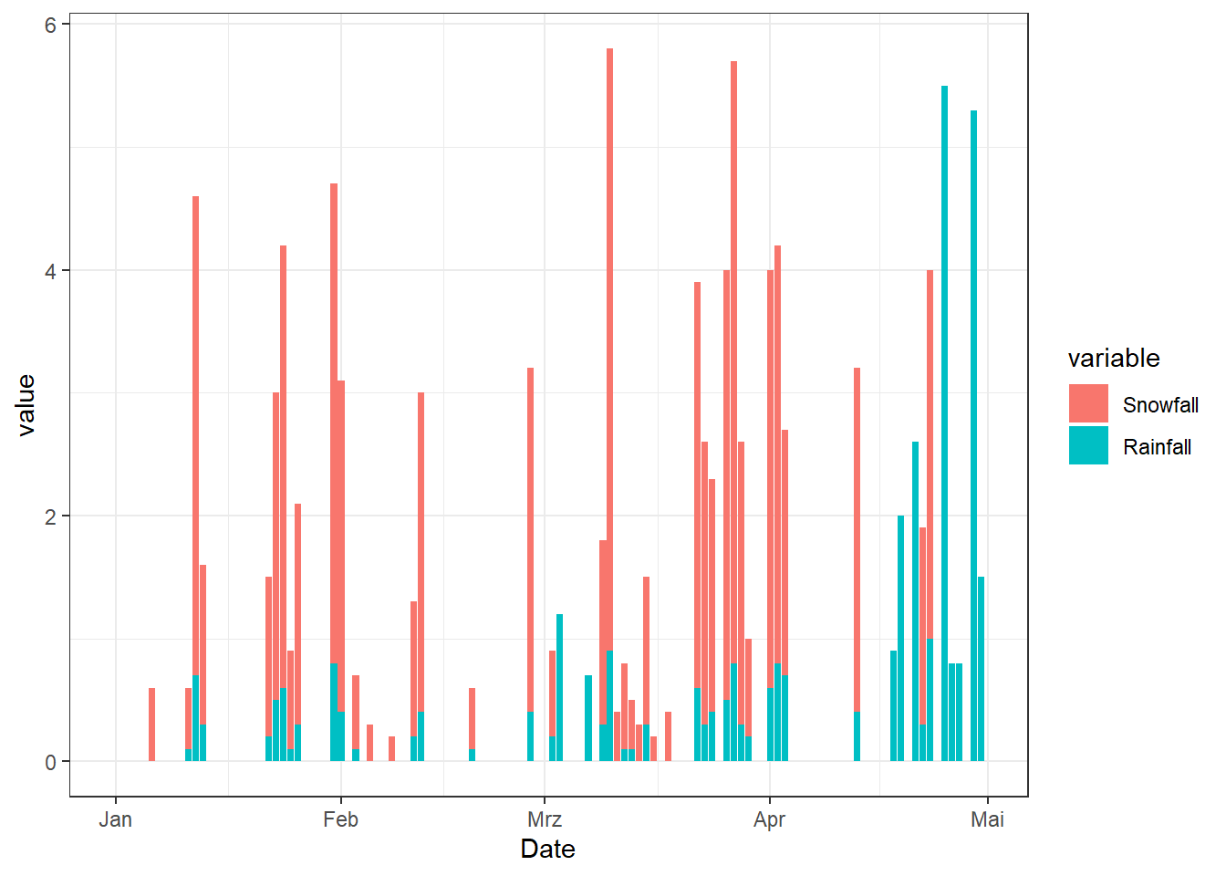
3.3 Dodge
# Plot
ggplot(df_Plot_Melt2, aes(x = Date, y = value, fill = variable, group = variable)) +
  geom_col(position="dodge")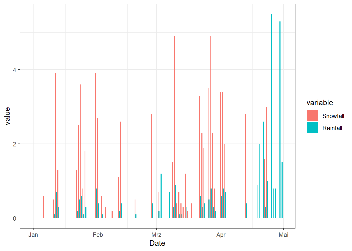
4 Trend Line
A trend line, also known as a regression line, is a straight line that best represents the general direction of a series of data points.
library(xts)
xts_ResultsHBV <- as.xts(df_ResultHBV)
xts_Temperature_Year <- apply.yearly(xts_ResultsHBV$Temperature, mean)
df_T_Year <- data.frame(Year = year(index(xts_Temperature_Year)), xts_Temperature_Year)
ggplot(df_T_Year, aes(x = Year, y = Temperature)) +
  geom_point() +
  geom_smooth(method = "lm", formula= y~x)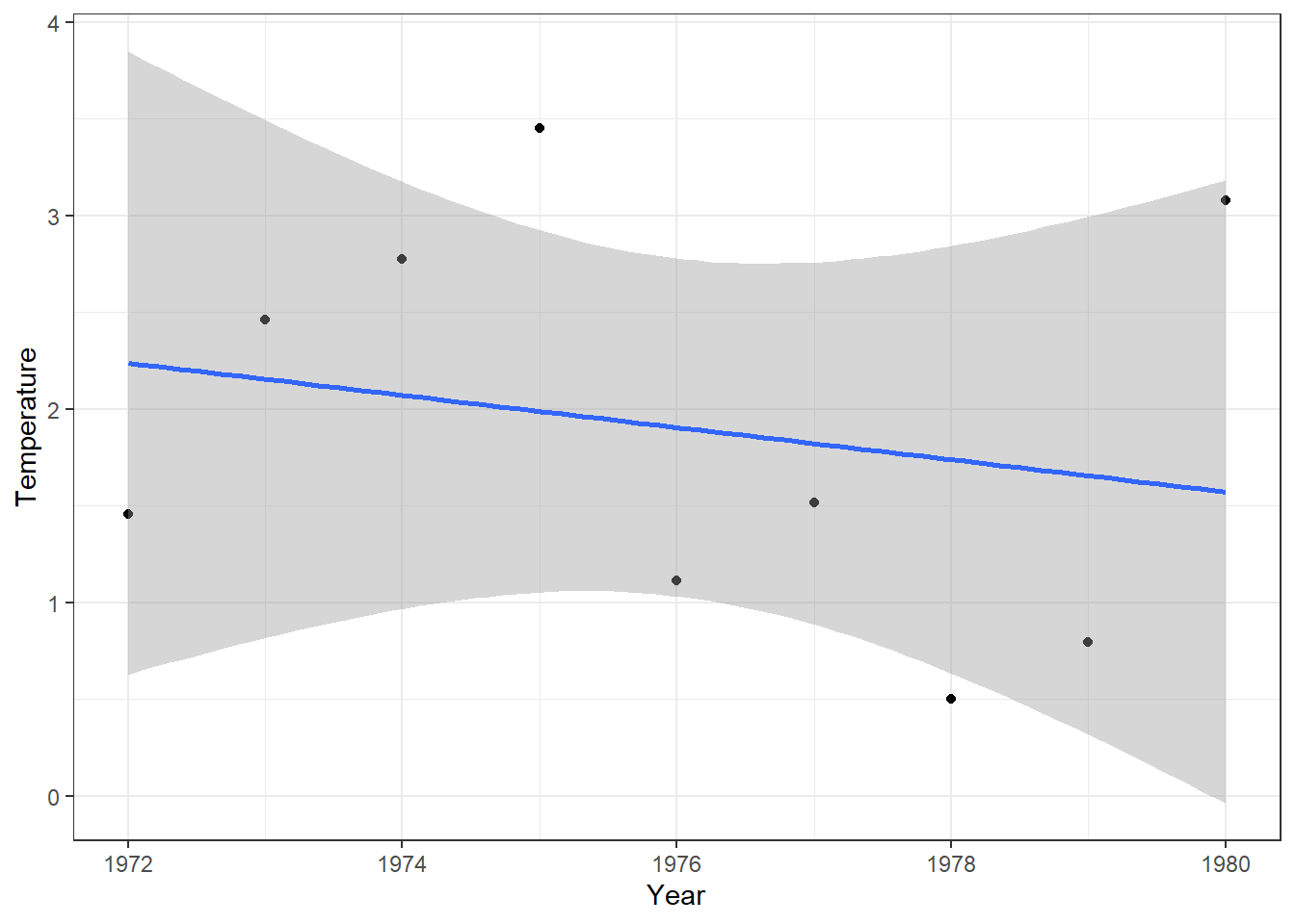
5 Smooth Line
xts_Temperature_Month <- apply.monthly(xts_ResultsHBV$Temperature, mean)
df_T_Month <- data.frame(Year = year(index(xts_Temperature_Month)),
                        Month = month(index(xts_Temperature_Month)), xts_Temperature_Month)
ggplot(df_T_Month, aes(x = Month, y = Temperature)) +
  geom_point(aes(color = Year)) + geom_line(aes(color = Year, group = Year)) +
  geom_smooth(formula= y~x, color = "red")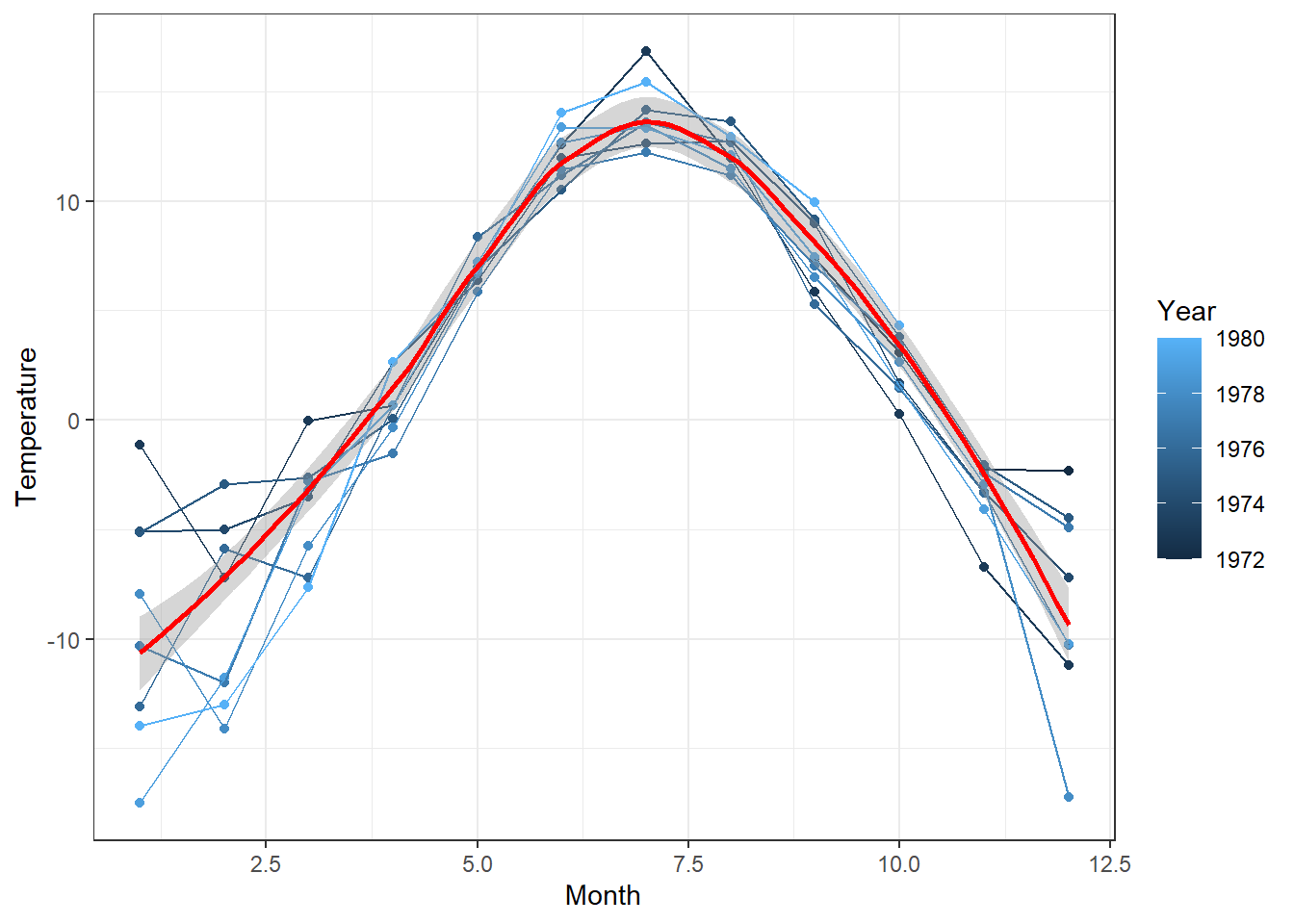
6 Areaplot
6.1 Stacked Area
A stacked area plot is a type of data visualization that displays the cumulative contribution of different groups to a total over time or another continuous variable. Each group’s contribution is represented as a colored area, and these areas are stacked on top of each other.
# Data
melt_Balance_Q <- df_Plot[,c("Date", "AET", "Q0", "Q1", "Q2" )] |> melt(id = "Date")
# Plot
ggplot(melt_Balance_Q, aes(Date, value, fill = variable)) +
geom_area() 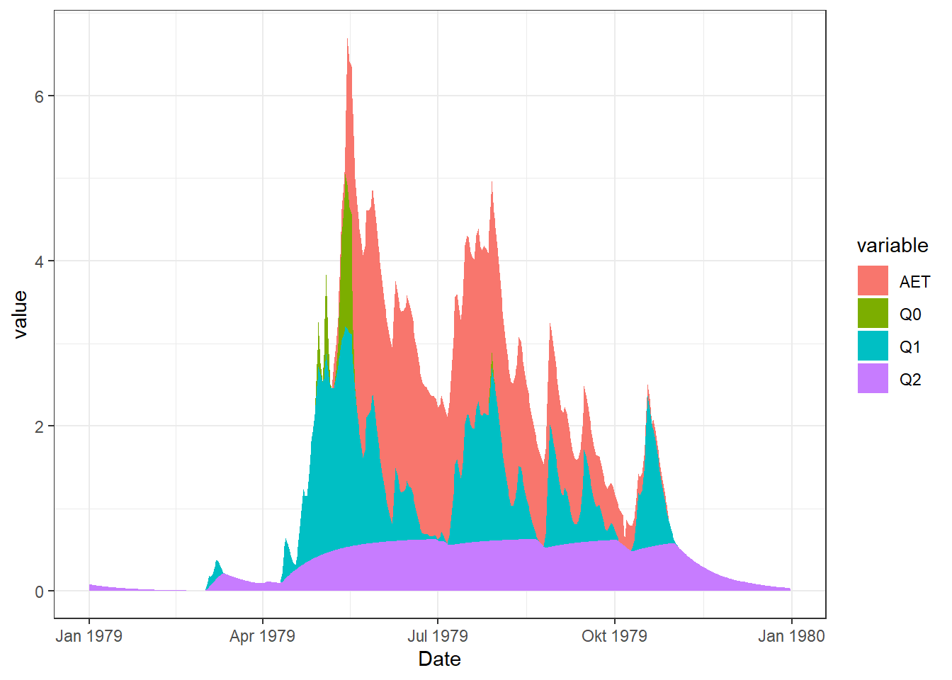
6.2 Percent Area
A percent stacked area plot is a variation of the stacked area plot where the y-axis represents percentages, showcasing the proportion of each group relative to the total at each point in time. This type of plot is particularly useful when you want to emphasize the relative distribution of different groups over time.
# Data
melt_Balance_Q$perc <- melt_Balance_Q$value / rowSums(df_Plot[,c("AET", "Q0", "Q1", "Q2" )])
# PLot
ggplot(melt_Balance_Q, aes(Date, perc, fill = variable)) +
geom_area() 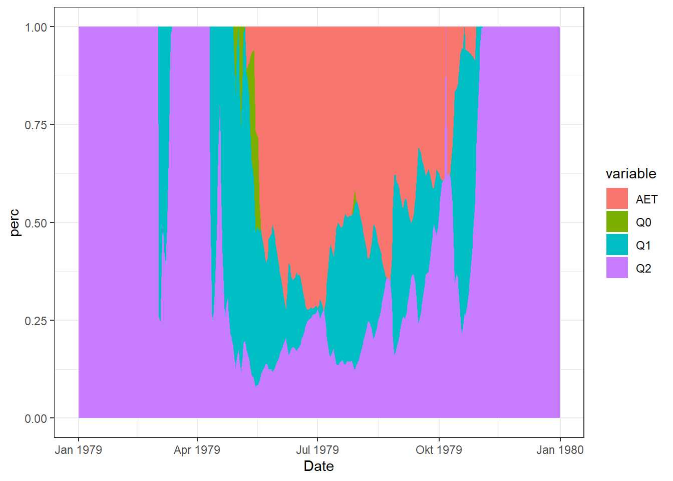
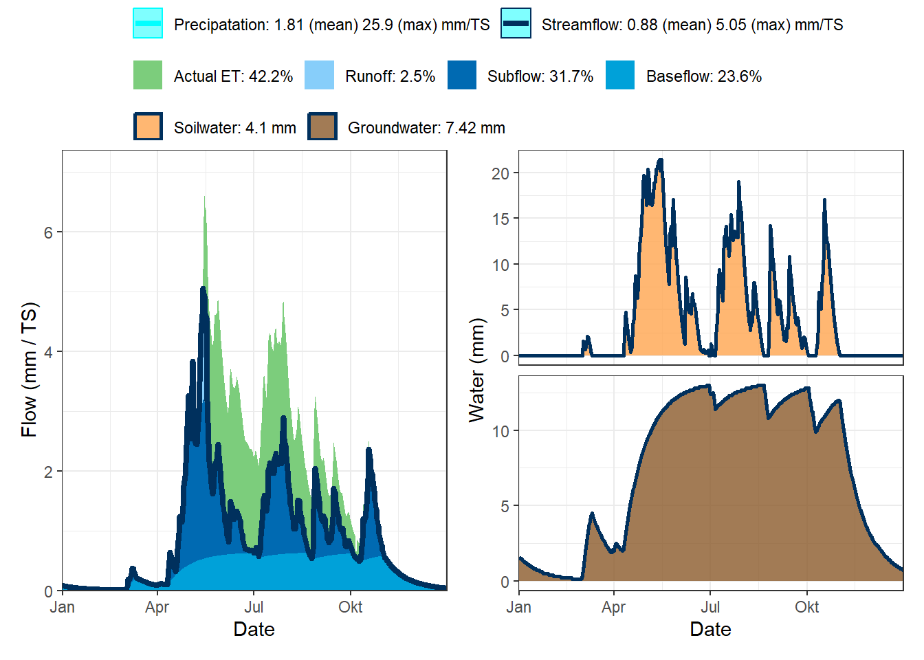
7 Water Balance
# If don't installed:
# If remotes not installed, use: install.packages("remotes")
# remotes::install_github("HydroSimul/HydroRUB")
library(HydroRUB)
plot_water_balance.HBV(df_Plot)