# Library
library(xts)
library(tidyverse)
theme_set(theme_bw())
library(plotly)

# File name
fn_Bachum <- "https://raw.githubusercontent.com/HydroSimul/Web/main/data_share/Bachum_2763190000100.csv"
fn_Oeventrop <- "https://raw.githubusercontent.com/HydroSimul/Web/main/data_share/Oeventrop_2761759000100.csv"
fn_Villigst <- "https://raw.githubusercontent.com/HydroSimul/Web/main/data_share/Villigst_2765590000100.csv"

# Load Data
df_Bachum <- read_csv2(fn_Bachum, skip = 10, col_names = FALSE)
df_Oeventrop <- read_csv2(fn_Oeventrop, skip = 10, col_names = FALSE)
df_Villigst <- read_csv2(fn_Villigst, skip = 10, col_names = FALSE)

# Convert Date column to a Date type
df_Bachum$X1 <- as_date(df_Bachum$X1, format = "%d.%m.%Y")
df_Oeventrop$X1 <- as_date(df_Oeventrop$X1, format = "%d.%m.%Y")
df_Villigst$X1 <- as_date(df_Villigst$X1, format = "%d.%m.%Y")

# Create an xts object
xts_Bachum <- as.xts(df_Bachum)
xts_Oeventrop <- as.xts(df_Oeventrop)
xts_Villigst <- as.xts(df_Villigst)

# Merge into one data frame
xts_Rhur <- merge(xts_Bachum, xts_Oeventrop, xts_Villigst)
names(xts_Rhur) <- c("Bachum", "Oeventrop", "Villigst")
xts_Rhur <- xts_Rhur[seq(as_date("1991-01-01"), as_date("2020-12-31"), "days"), ]

# Deal with negative
df_Ruhr <- coredata(xts_Rhur)
df_Ruhr[df_Ruhr < 0] <- NA

# Summary in month
xts_Ruhr_Clean <- xts(df_Ruhr, index(xts_Rhur))
df_Ruhr_Month <- apply.monthly(xts_Ruhr_Clean, mean)Graphical Statistic
Graphical statistic is a branch of statistics that involves using visual representations to analyze and communicate data. It provides a powerful way to convey complex information in a more understandable and intuitive form.
1 Example Data
The example files provided consist of three discharge time series for the Ruhr River in the Rhein basin, Germany. These data sets are sourced from open data available at ELWAS-WEB NRW. You can also access it directly from the internet via Github.
In this article, we will leverage the power of the ggplot2 library to create plots and visualizations. To achieve this, the first step is to reformat the dataframe to a structure suitable for plotting.
gdf_Ruhr <- reshape2::melt(data.frame(date=index(df_Ruhr_Month), df_Ruhr_Month), "date")2 Timeserise line
The time series lines will provide us with discharge from 1991-01-01 to 2020-12-31 of the three gauges.
geom_line()
gg_TS_Ruhr <- ggplot(gdf_Ruhr) +
  geom_line(aes(date, value, color = variable)) +
  labs(x = "Date", y = "Discharge [m^3/s]", color = "Gauge")

ggplotly(gg_TS_Ruhr)
3 Frequency Plots/Histogram
Histograms and frequency plots are graphical representations of data distribution.
Histograms display the counts (or frequency) with bars; frequency plots display the counts (or frequency) with lines.
The frequency plot represents the relative density of the data points by the relative height of the bars, while in a histogram, the area within the bar represents the relative density of the data points.
geom_histogram()
gg_Hist_Ruhr <- ggplot(gdf_Ruhr) +
  geom_histogram(aes(value, group = variable, fill = variable, color = variable), position = "dodge", alpha = .5) +
  labs(y = "Count", x = "Discharge [m^3/s]", color = "Gauge", fill = "Gauge")

ggplotly(gg_Hist_Ruhr)
geom_freqpoly()
gg_Freq_Ruhr <- ggplot(gdf_Ruhr) +
  geom_freqpoly(aes(value, y = after_stat(count / sum(count)), group = variable, fill = variable, color = variable)) +
  labs(y = "Frequency", x = "Discharge [m^3/s]", color = "Gauge")

ggplotly(gg_Freq_Ruhr)
4 Box and Whisker Plot
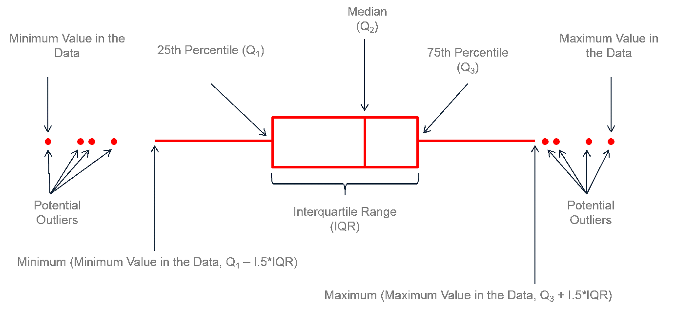
A Box and Whisker Plot, also known as a box plot, is a graphical representation of the distribution of a dataset. It provides a concise summary of the dataset’s key statistical measures and helps you visualize the spread and skewness of the data (Machiwal and Jha 2012). Here’s how a typical box and whisker plot is structured:
Box: The box in the middle of the plot represents the interquartile range (IQR), which contains the middle 50% of the data. The bottom edge of the box represents the 25th percentile (Q1), and the top edge represents the 75th percentile (Q3).
Whiskers: The whiskers extend from the box and represent the range of the data, excluding outliers. They typically extend to a certain multiple of the IQR beyond the quartiles. Outliers beyond the whiskers are often plotted as individual points.
Median (line inside the box): A horizontal line inside the box represents the median (Q2), which is the middle value of the dataset when it’s sorted.
gg_Box_Ruhr <- ggplot(gdf_Ruhr) +
  geom_boxplot(aes(variable, value, fill = variable, color = variable), alpha = .5) +
  labs(x = "Gauge", y = "Discharge [m^3/s]", color = "Gauge") +
  theme(legend.position = "none")

ggplotly(gg_Box_Ruhr)
5 Quantile Plot
A ‘quantile plot’ can be used to evaluate the quantile information such as the median, quartiles, and interquartile range of the data points (Machiwal and Jha 2012).
geom_qq()
gg_QQ_Ruhr <- ggplot(gdf_Ruhr, aes(sample = value, color = variable)) +
  geom_qq(alpha = .5, distribution = stats::qunif) +
  geom_qq_line(distribution = stats::qunif) +
  labs(x = "Fraction", y = "Discharge [m^3/s]", color = "Gauge")

ggplotly(gg_QQ_Ruhr)
References
Machiwal, Deepesh, and Madan Kumar Jha. 2012. Hydrologic Time Series Analysis: Theory and Practice. Neu Dehli: Captial Publishing Company.