# Load ggplot2 library
library(ggplot2)

# Create a sample dataset
data <- data.frame(
  x = rnorm(50),
  y = rnorm(50),
  group = rep(c("A", "B"), each = 25)
)
The elements of a plot
At the beginning of plotting, we can first examine the elements of a plot that provide an overview. These include the background, panel, title, and axes. While they may not be as visually prominent as the main plot elements (points or lines), they are crucial for extracting meaningful information from a plot.
In this section, we will leverage concepts from ggplot2. These concepts are fundamental not only to ggplot2 but also to other plotting engines. This article will primarily focus on the section on Theme Elements in the book “ggplot2: Elegant Graphics for Data Analysis (3e)” by Hadley Wickham (2009).
Under ggplot2, these elements are divided into five groups: plot, axis, legend, panel, and facet. However, for a single plot, we will not delve into the fifth facet group.

To illustrate these elements, we will use a random dataset to create a scatter plot as an example.
Important
This article will focus on illustrating the elements, while the techniques for manipulating and changing the content of these elements will be covered in a separate article. With this article, you can get a basic impression of the plot.
The original plot appears as follows:
gp_Test <- ggplot(data, aes(x, y, color = group)) +
  geom_point()

gp_Test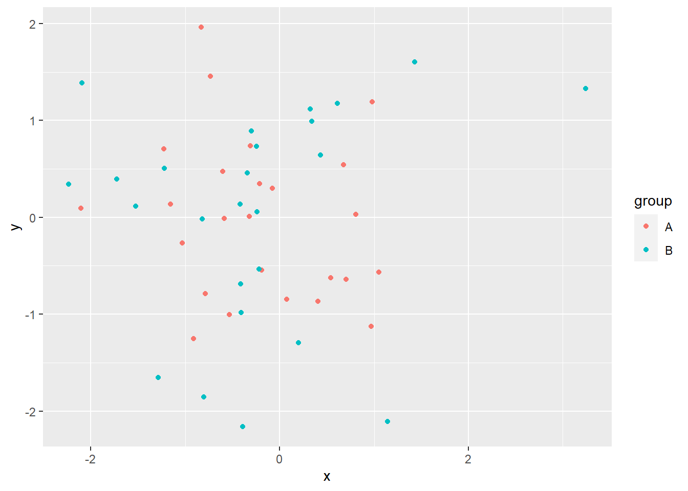
1 Plot elements
The “plot” represents the entire plot, basically, defining the background on which all other elements are drawn. There are three main elements related to the plot:
plot.background: background rectangle areaplot.title: title for the whole plotplot.margin: margins around the plot
gp_Test +
  theme(plot.background = element_rect(fill = "red"))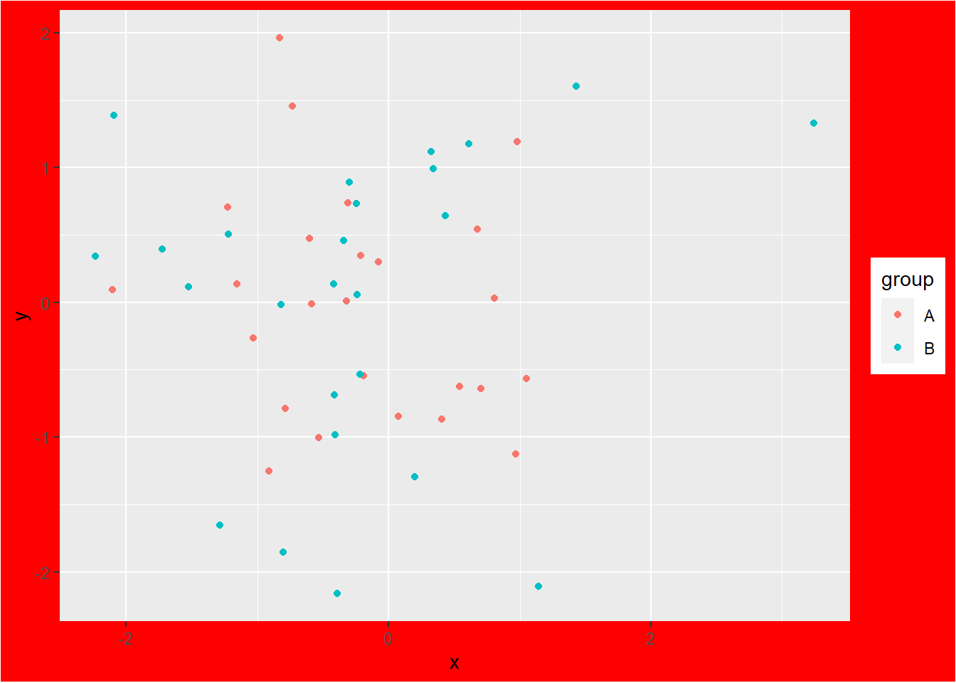
gp_Test +
  ggtitle("Title in red") +
  theme(plot.title = element_text(color = "red"))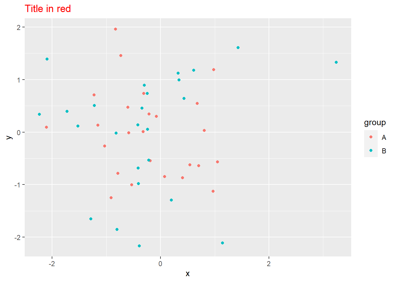
gp_Test +
  theme(plot.background = element_rect(fill = "red"),
        plot.margin = margin(10,10,10,10, "mm"))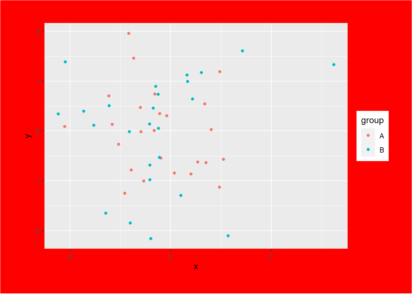
2 Axis elements
The “axis” in a plot provides a crucial reference for interpreting the data or a scale for measurement. It consists of tick marks, labels, and a title. The axis allows viewers to understand the quantitative values represented in the plot, aiding in data analysis and visualization.
There are four main elements related to the axis:
axis.line: line parallel to axisaxis.text: tick labels (axis.text.x,axis.text.y)axis.title: axis titles (axis.title.x,axis.title.y)axis.ticks: axis tick marksaxis.ticks.length: length of tick marks
gp_Test +
  theme(axis.line = element_line(color = "red", linewidth = 2))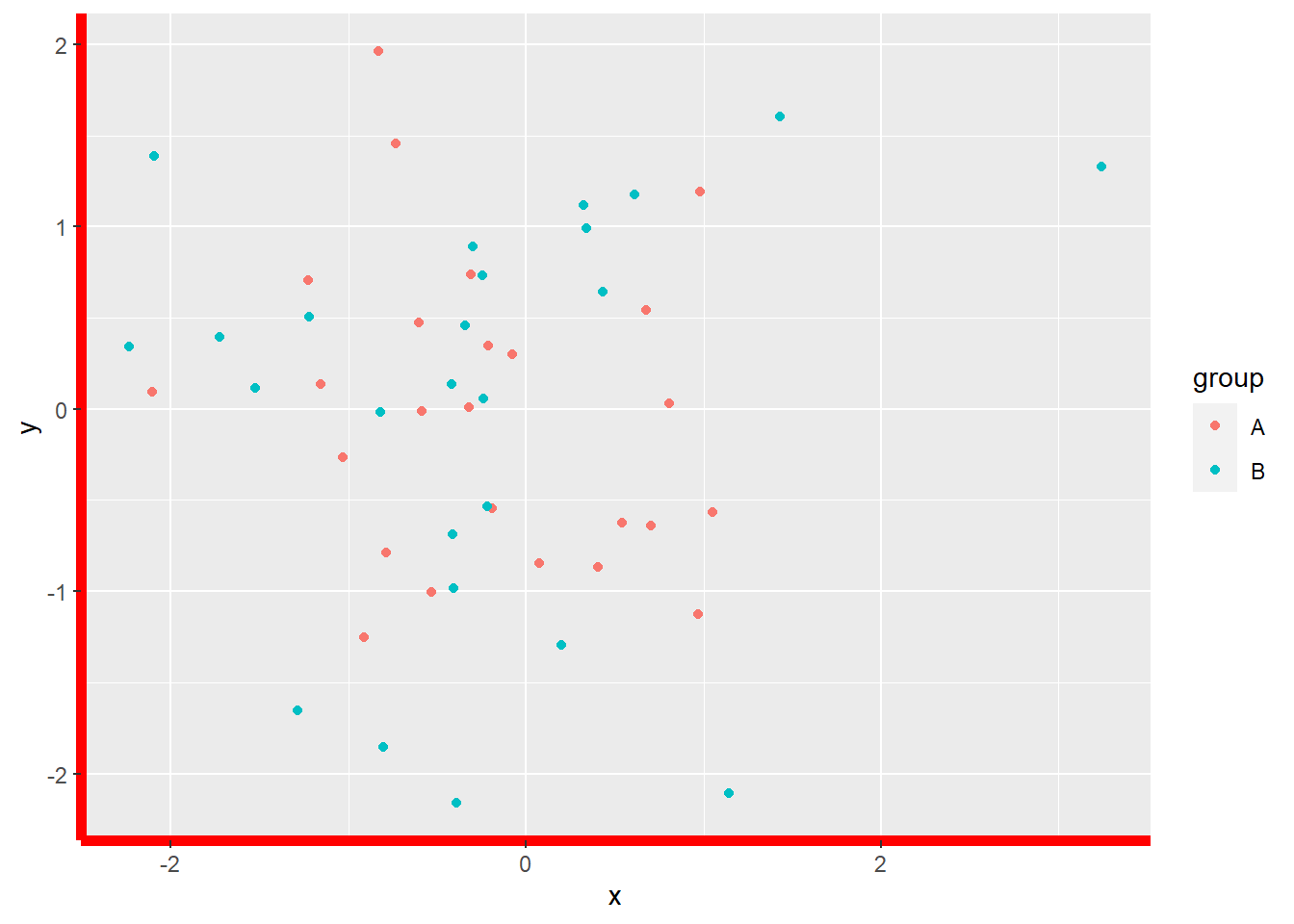
gp_Test +
  theme(axis.text = element_text(color = "red", size = 15))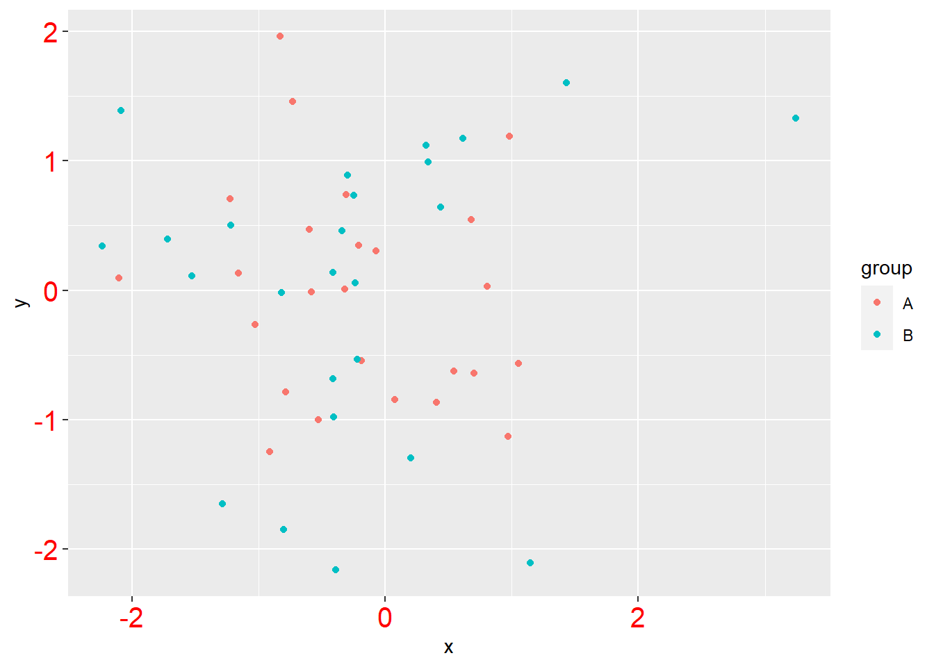
gp_Test +
  theme(axis.title = element_text(color = "red", size = 15))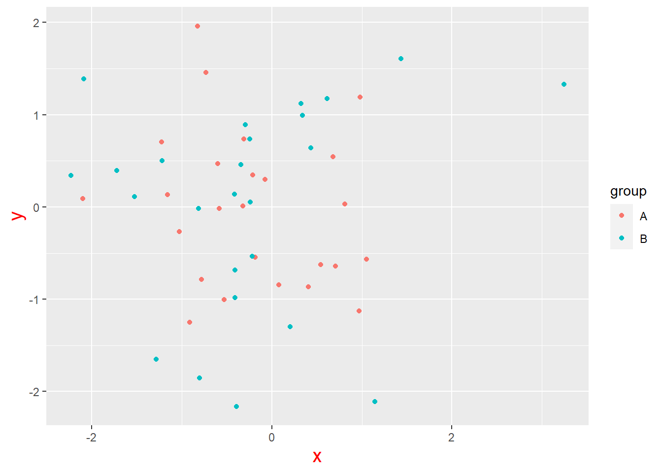
gp_Test +
  theme(axis.ticks = element_line(color = "red", linewidth = 2),
        axis.ticks.length = unit(2, "mm"))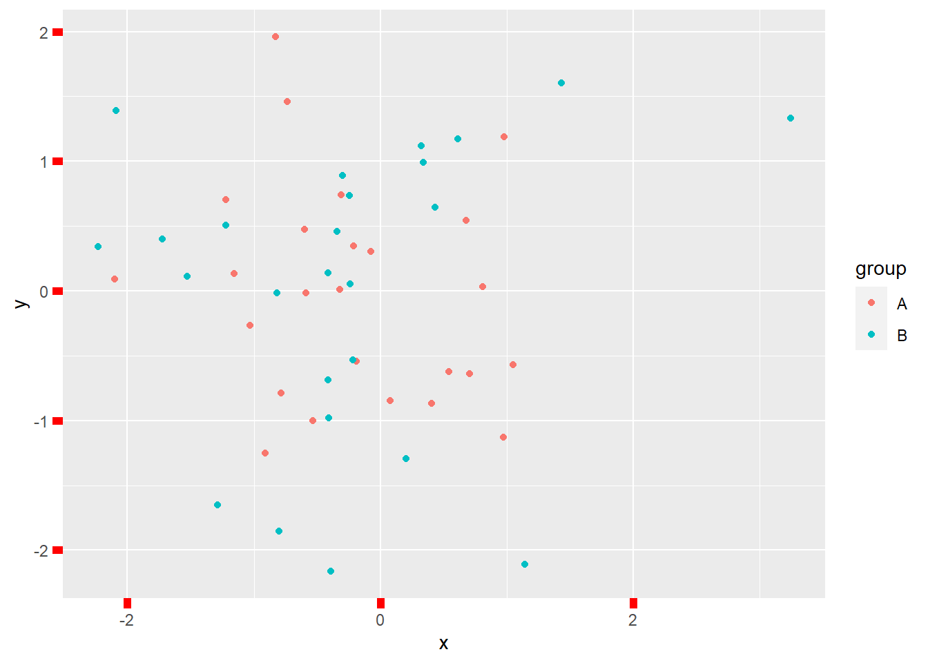
3 Legend elements
The “legend” elements control the appearance of all legends. You can also modify the appearance of individual legends by modifying the same elements in guide_legend() or guide_colourbar() (Wickham 2009).
There are four main elements related to the legend:
legend.background: legend backgroundlegend.margin: legend margin
legend.key: background of legend keyslegend.key.size: legend key sizelegend.key.height: legend key heightlegend.key.width: legend key width
legend.text: legend labelslegend.title: legend name
gp_Test +
  theme(legend.background = element_rect(fill = "red"),
        legend.margin = margin(10,10,10,10, "mm"))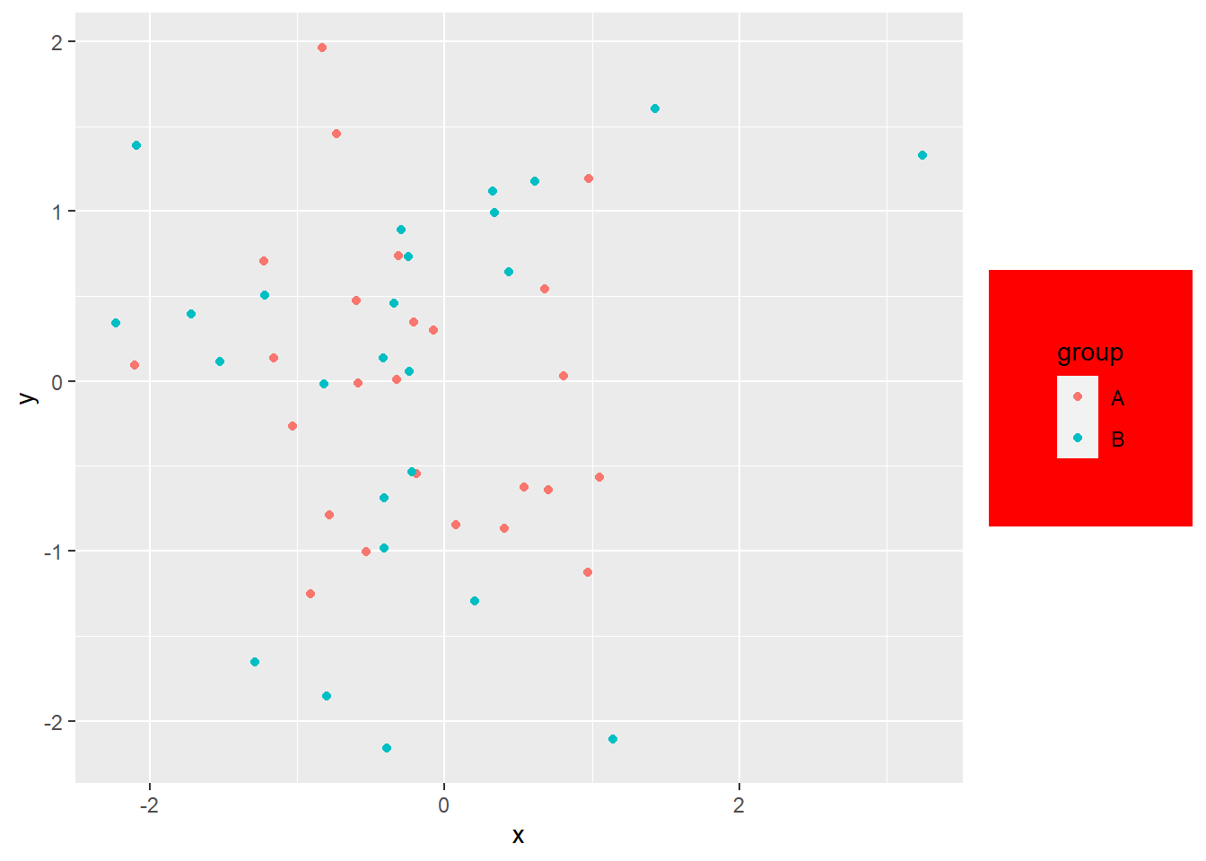
gp_Test +
  theme(legend.key = element_rect(fill = "red"),
        legend.key.size = unit(10, "mm"))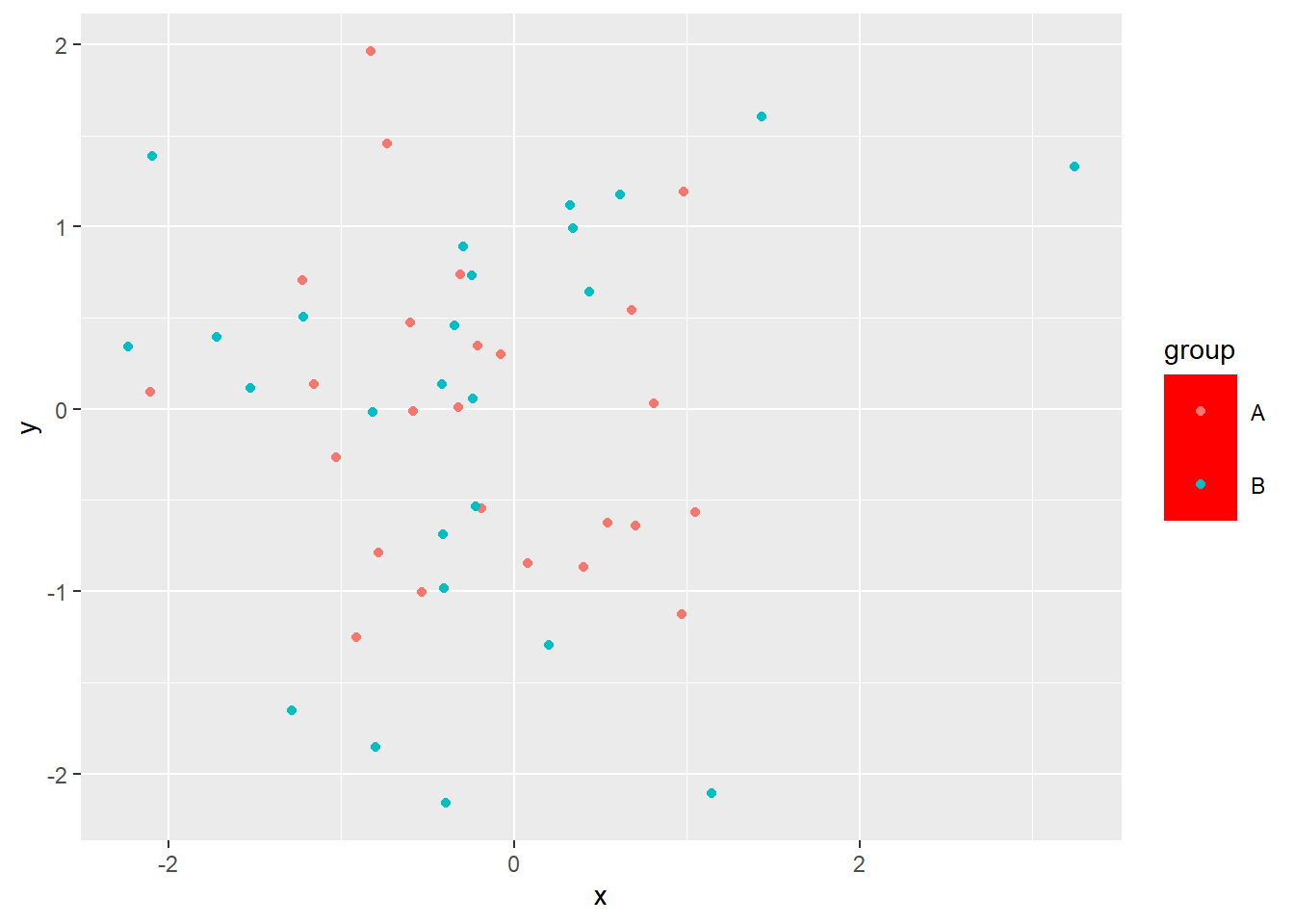
gp_Test +
  theme(legend.text = element_text(color = "red", size = 15))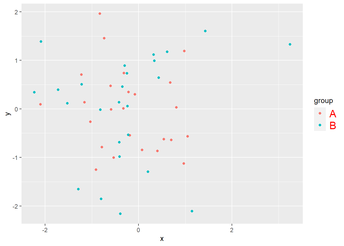
gp_Test +
  theme(legend.title = element_text(color = "red", size = 15))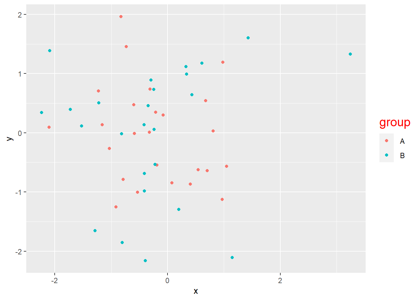
4 Panel elements
The “panel” in a plot is the central area where the main data representation.
There are four main elements related to the panel:
panel.background: panel background (under data)panel.border: panel border (over data)panel.grid.major(panel.grid.minor): major / minor grid linesaspect.ratio: plot aspect ratio
gp_Test +
  theme(panel.background = element_rect(fill = "red"))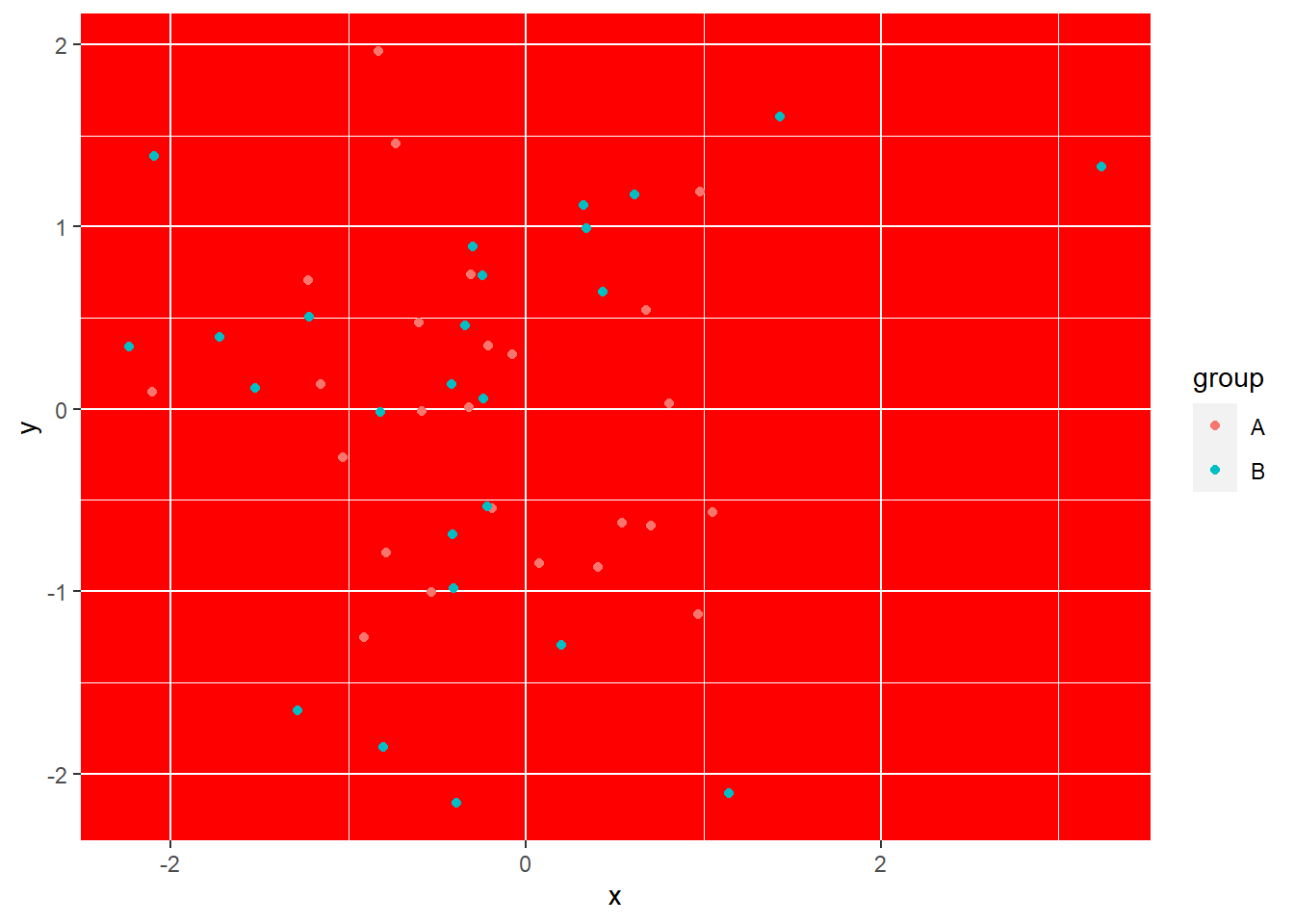
gp_Test +
  theme(panel.border = element_rect(color = "red", fill = NA, linewidth = 2))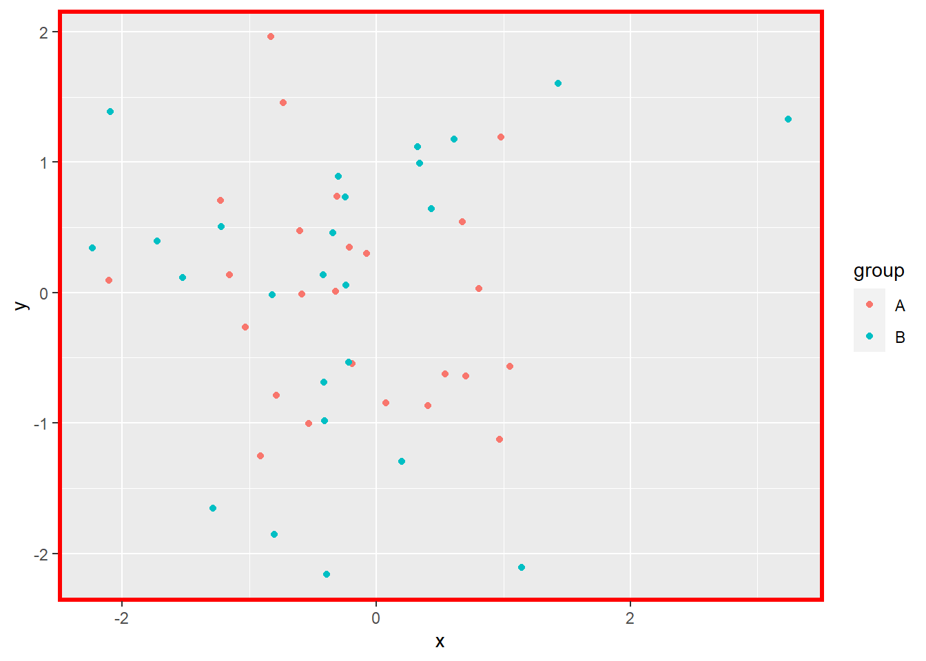
If the fill parameter is not set to NA (transparent), it will cover the main plot:
gp_Test +
  theme(panel.border = element_rect(color = "red", fill = "green", linewidth = 2))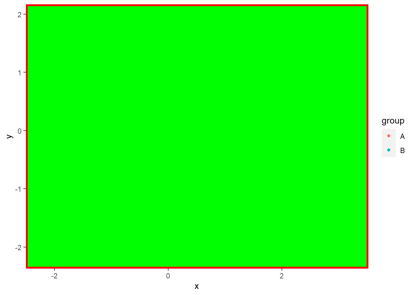
gp_Test +
  theme(panel.grid.major = element_line(color = "red", linewidth = 2))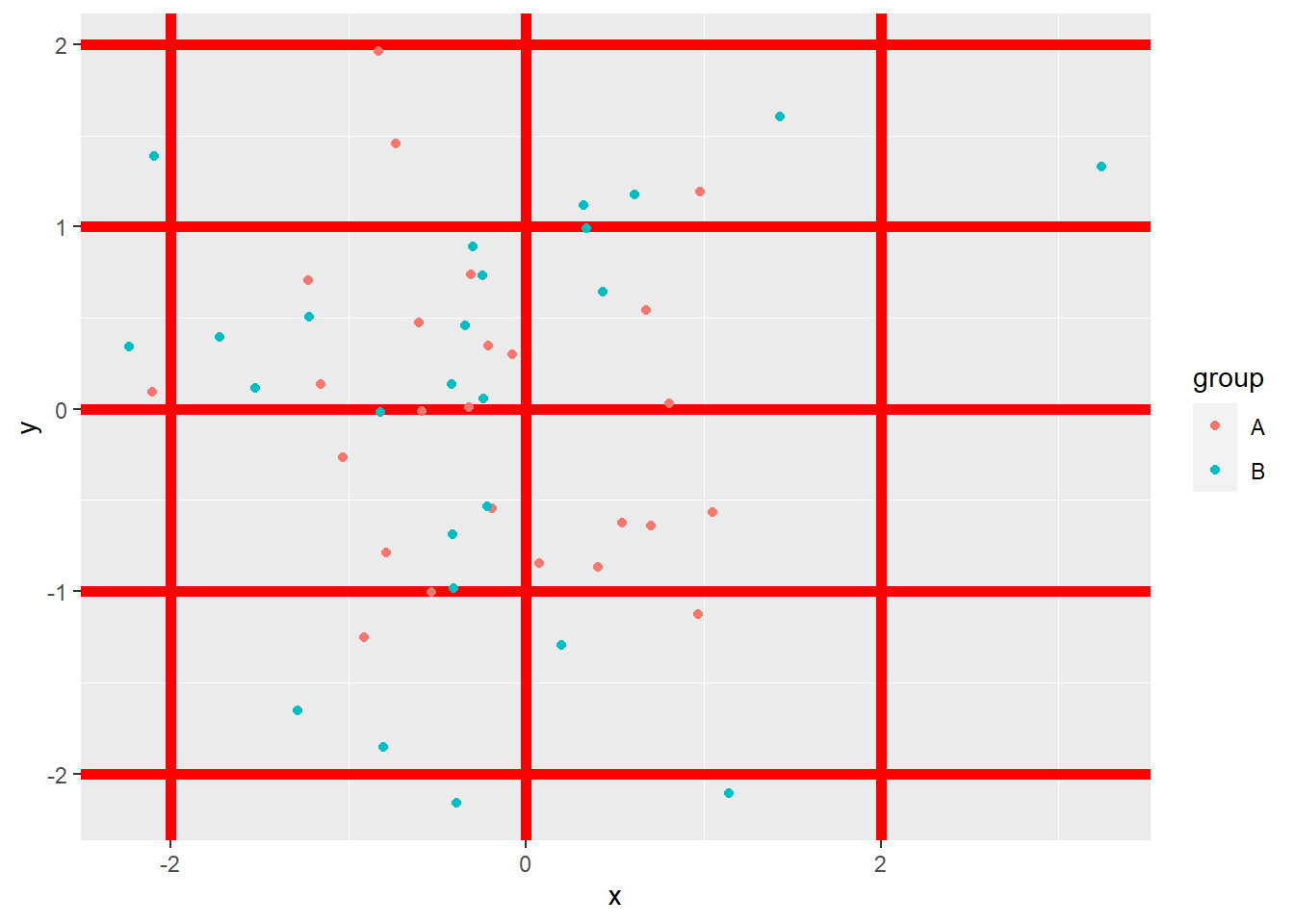
gp_Test +
  theme(aspect.ratio = 2)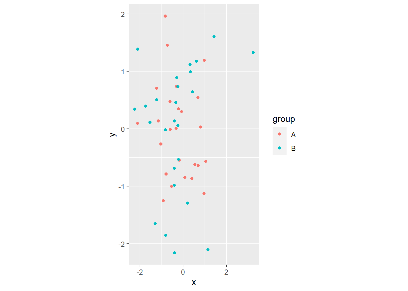
References
Wickham, Hadley. 2009. Ggplot2: Elegant Graphics for Data Analysis. New York, NY: Springer. https://doi.org/10.1007/978-0-387-98141-3.